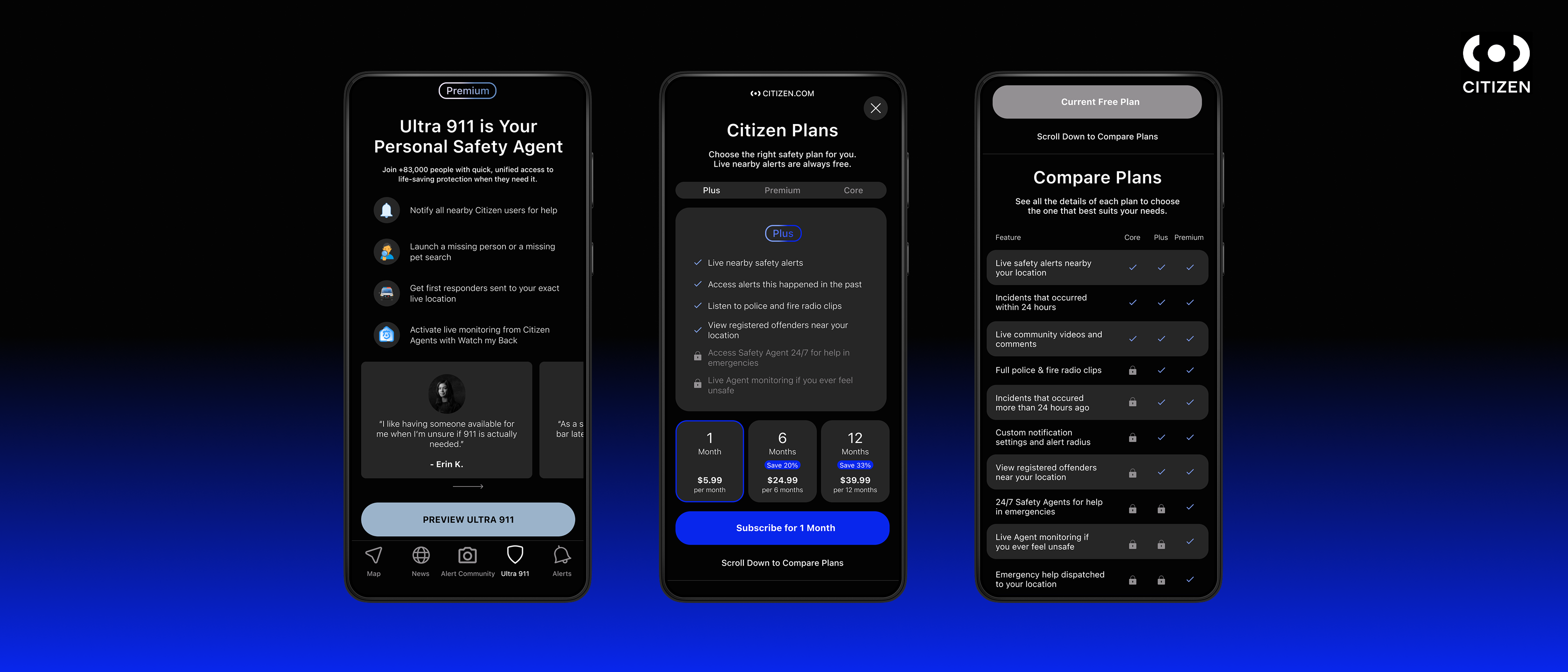
Citizen's premium Ultra 911 feature promises users a personal safety agent — someone who can reach emergency services on their behalf the moment something feels wrong. However, deceptive design is used to aggressively push their subscription, raising ethical concerns over restricting access to public safety features.
I redesigned Ultra 911's paywall to prioritize clarity over pressure. I mapped Citizen's existing flow, identified three dark patterns baked into its design, and rebuilt the flow around a single comparison-first page. I tested the redesign with 5 users across two rounds, then refined the wording, navigation, and visual hierarchy based on what they struggled with.
Citizen is a real-time safety app used by millions to track local incidents and emergencies. Ultra 911 is its paid tier, offering a live agent who can contact police, fire, or EMS on a user's behalf — services that are, on their own, already free and public. This project began as a dark-pattern teardown for a class assignment and grew into a full ethical redesign of the feature.
Ultra 911 looks like a standard subscription feature — tiers, perks, an upsell flow. But the services it sells aren't exclusive to Citizen. It repackages access that already exists into a faster interface, and charges for that convenience.
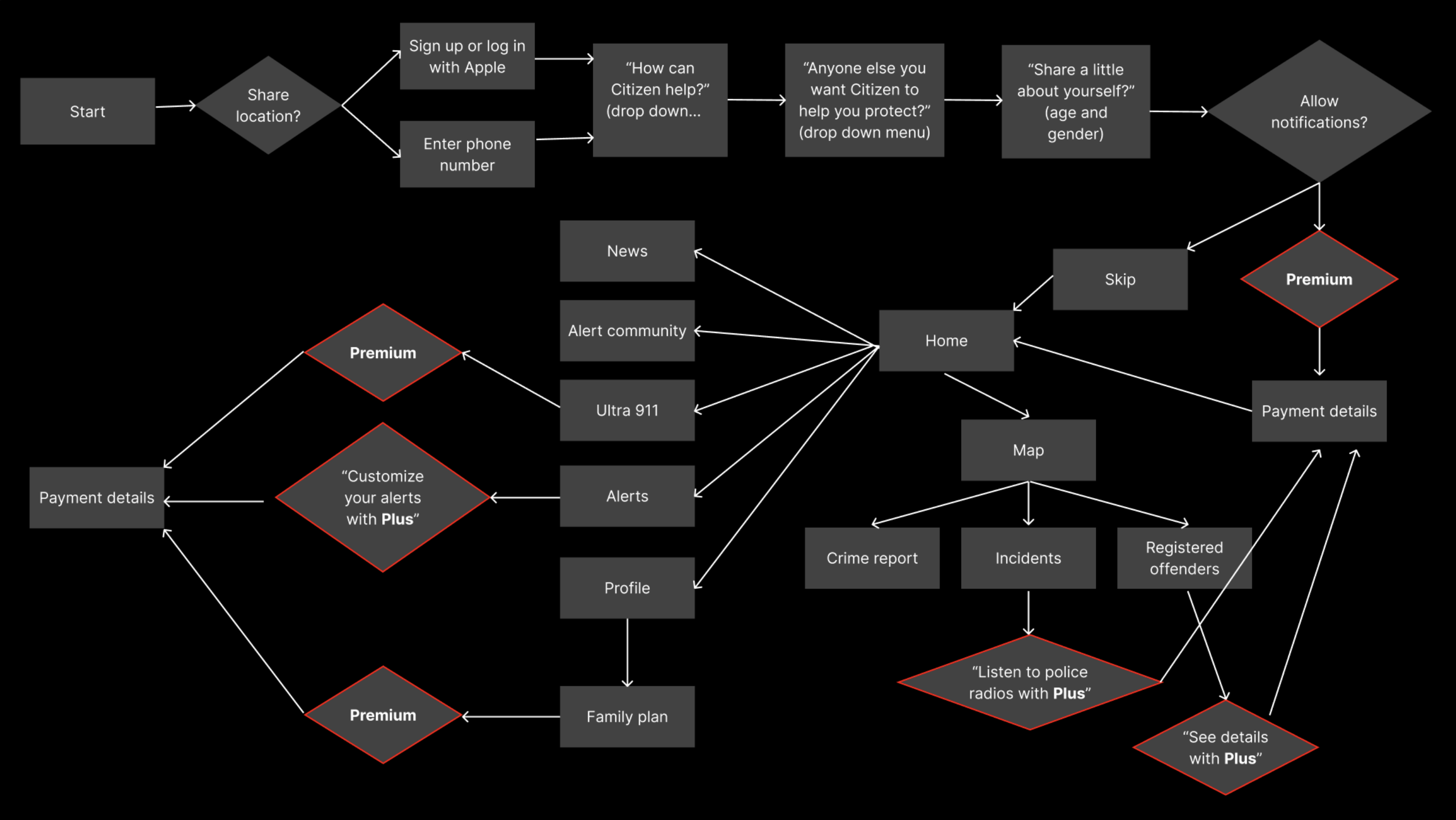
Before redesigning anything, I created a site map of Citizen's existing end-to-end user flow for Ultra 911. The app's main goal is for users to subscribe to paid tiers.
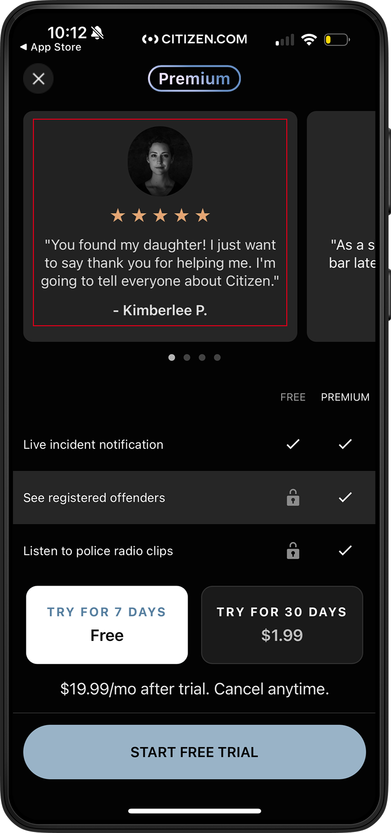
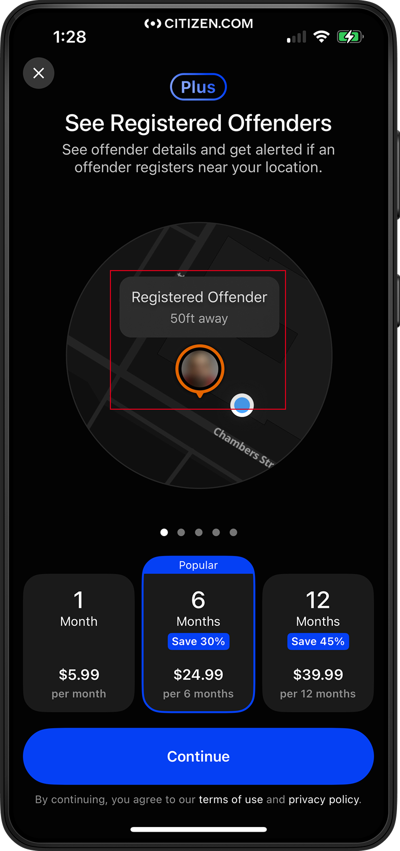
Their service is propped up by three dark patterns I identified in the original flow.
Users shouldn't have to guess what they're paying for, or feel like their safety depends on it. My redesign of Ultra 911 aims to enhance app transparency and reduce the pressure on users to feel like they need to pay in order to feel safe.
- Remove 5-stars from testimonials.
- Show all tiers instead of just Premium.
- Tier comparison readily shown instead of hidden in Settings.
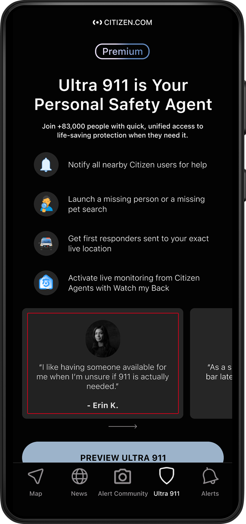
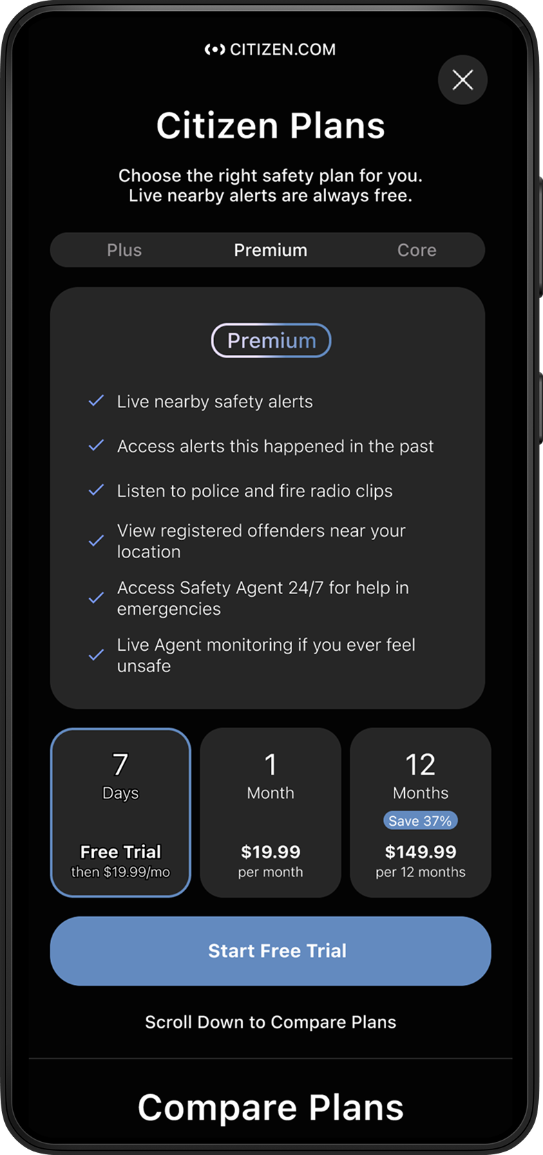
Although I mainly focused on the dark design patterns, I found that I could combat the dark ethics through some of the copy.
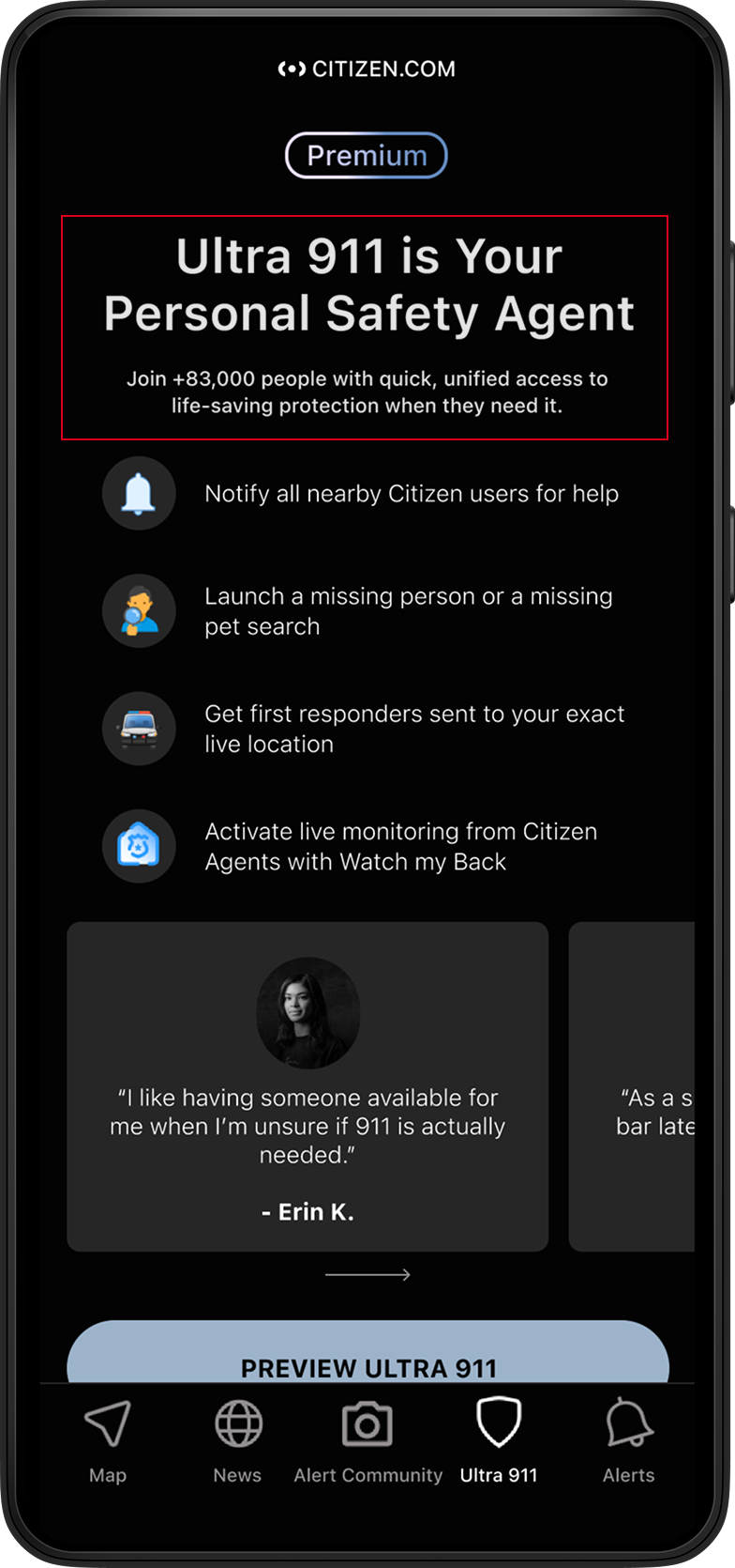
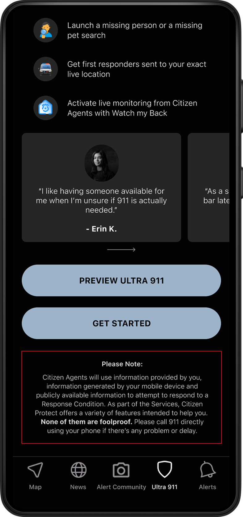
I ran 5 moderated interviews against my prototype, asking the same five questions each time.
- What do you think this app section, Ultra 911, is about? Is the purpose of this tool clear?
- Do you feel well educated on the different subscription and pricing tiers offered? If not, what is missing that could clear things up?
- Did you encounter any difficulty reading the text, distinguishing colors, or interacting with elements?
- Did you find the navigation clear and easy to use? If not, what was confusing?
- Is there anything else of note that popped into your mind?
After interviews, I adjusted wording as well as interactive features in order to make users less confused on functionality of buttons and scrolls.
By the final round of testing, every user could describe the pricing tiers accurately and navigate the flow without hesitation — a clear jump from round one, where scrolling and CTA confusion were the most common friction points. More importantly, the redesign proved that transparency and a working business model aren't mutually exclusive: users didn't need to be tricked into understanding what they were paying for.
If this shipped, I'd want to know whether transparency actually holds up against the business's subscription goals — not just assume it does.
- Conversion rate on the new comparison page vs. the old paywall flow
- Time-to-decision — are users converting faster with less confusion, or slower because they're more deliberate?
- Support ticket volume tied to billing or plan confusion
- 30-day churn after signup — a strong signal for whether users felt informed vs. pressured into paying
The legal or safety team would need to sign off on the disclaimer language, since it's pulled from Citizen's actual terms of service.
Beyond the interface, this project sharpened how I think about ethical redesign work:
Clean design doesn't resolve a grey business model. Stripping Ultra 911's dark patterns made the interface honest, but it didn't make the business model honest. Citizen profits from digitizing access to services that are already free and public, and no amount of clean UI resolves that tension. I made a deliberate choice not to pretend it did.
Intent isn't impact. Testing is the difference. The dark-pattern teardown told us what was manipulative, but it was in the two rounds of testing — watching users hesitate on scrolling and misread CTAs in round one, then retesting after refining wording and hierarchy — to confirm that dark patterns actually affect behavior, not just intention.