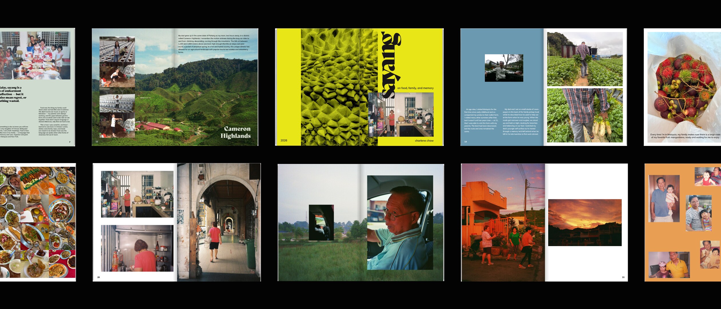
Sayang is a zine that uses photography, writing, and graphic design to explore how food functions as a language for familial love, care, memory, and grief. The word sayang — a Malay term of endearment that also means regret or something wasted — anchors the project's conceptual foundation. As the only daughter of Chinese-Malaysian immigrants, I created this work to trace the tender and complicated ways food has carried meaning across distance, between Malaysia and New York, and through the experience of migration and loss.
Sayang is structured as a visual and written narrative that pairs photography with written personal reflections. Food appears not as subject matter but as the thread connecting these themes together. By combining intentional design that gives the work room to breathe with family archive and personal photography — landscape and place in a physical sense, people and everyday intimacy in an emotional one — the zine becomes a personal reflection that aims to reach toward the viewer.
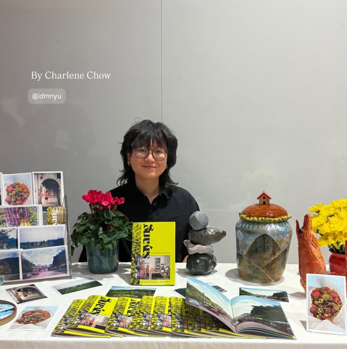
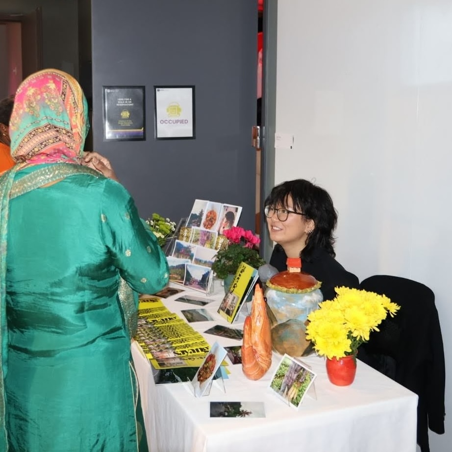
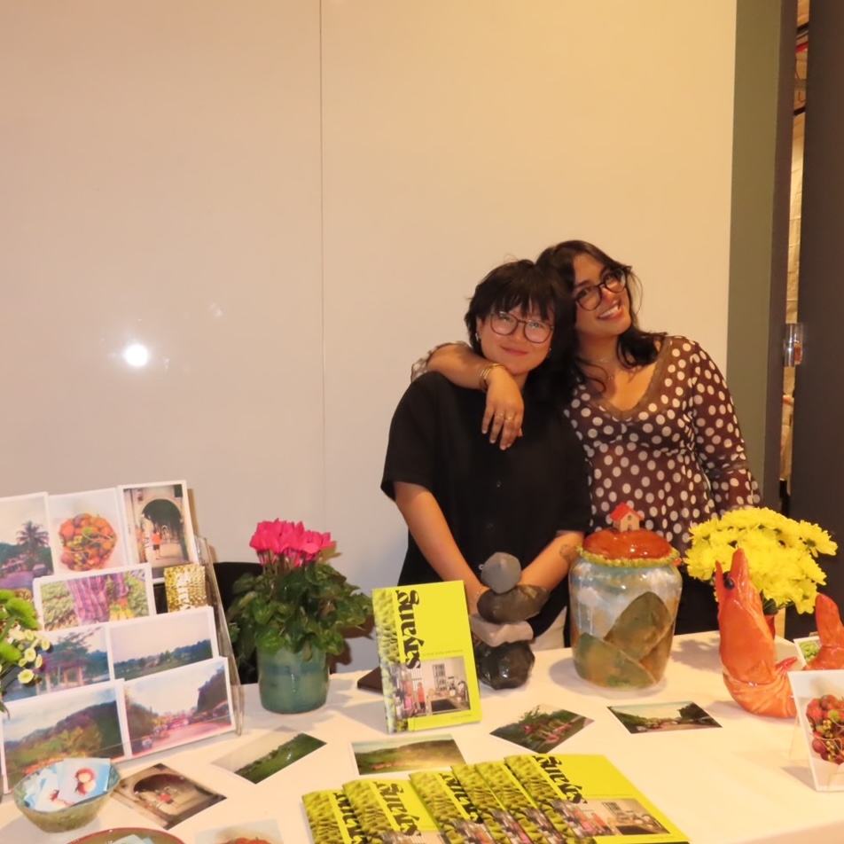
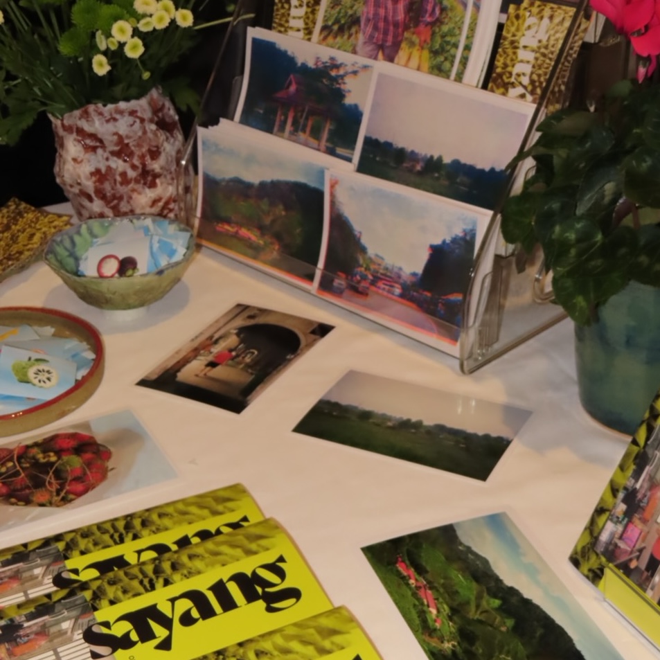
Sayang was created through a semester of reflection, collection, design, and production. It culminated in a final senior showcase with 800+ attendees. Alongside printed zines were ceramic sculptures, physical risograph and photo prints, stickers and business cards.
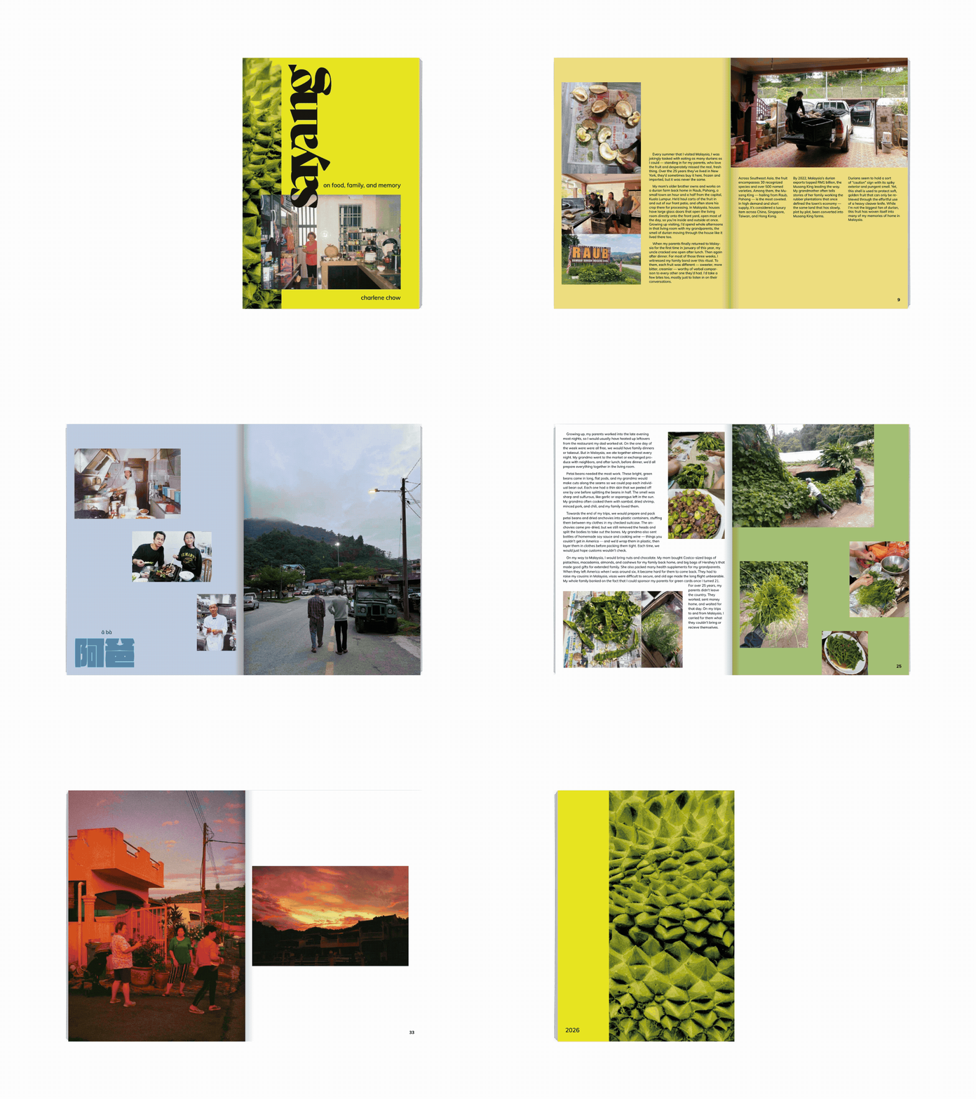
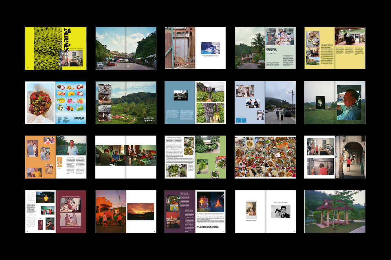
To start, I spent a majority of my time writing and collecting fragments from my journals, Notes app, and family photo albums. The storyline came from organizing my reflections and anecdotes to build out a story arc and structure before any images were placed against it. By the time I moved into visual work, the story order was locked, which meant I had greater confidence in every downstream decision about visual communication.
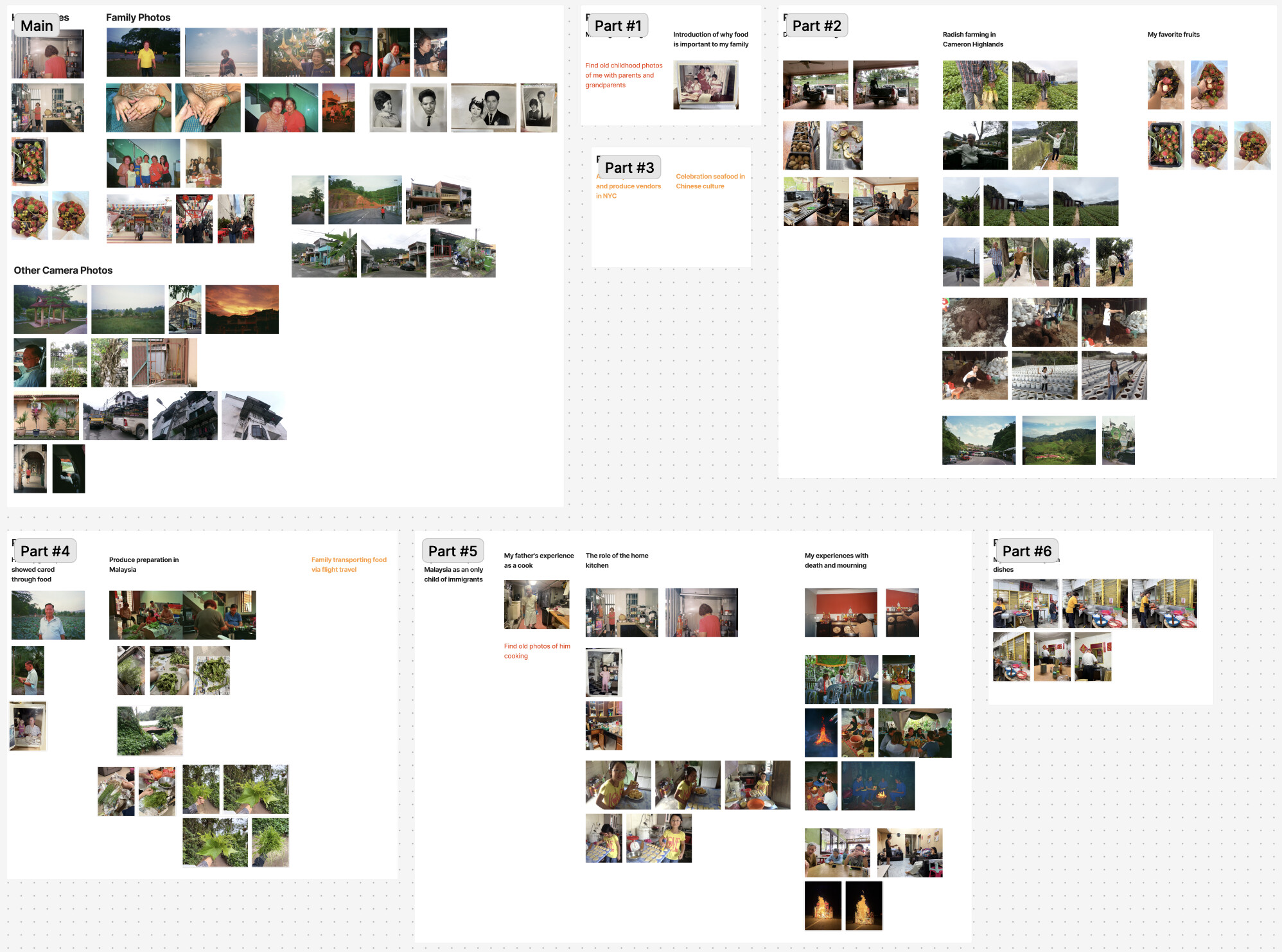
I then used FigJam as a place to visualize all my images and group them based on the themes I had written down. Photos were sorted into clusters that mirrored my writing.
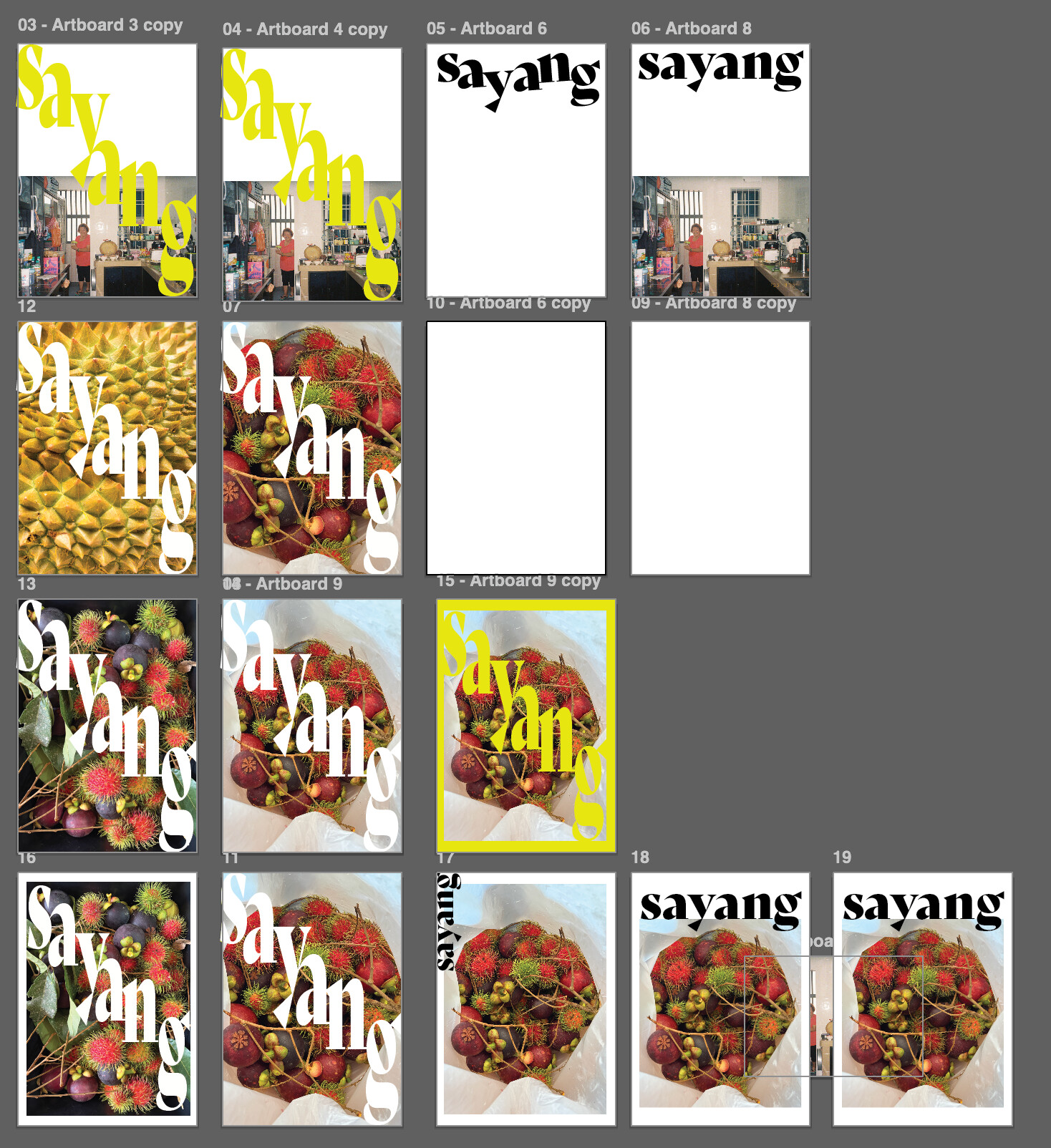
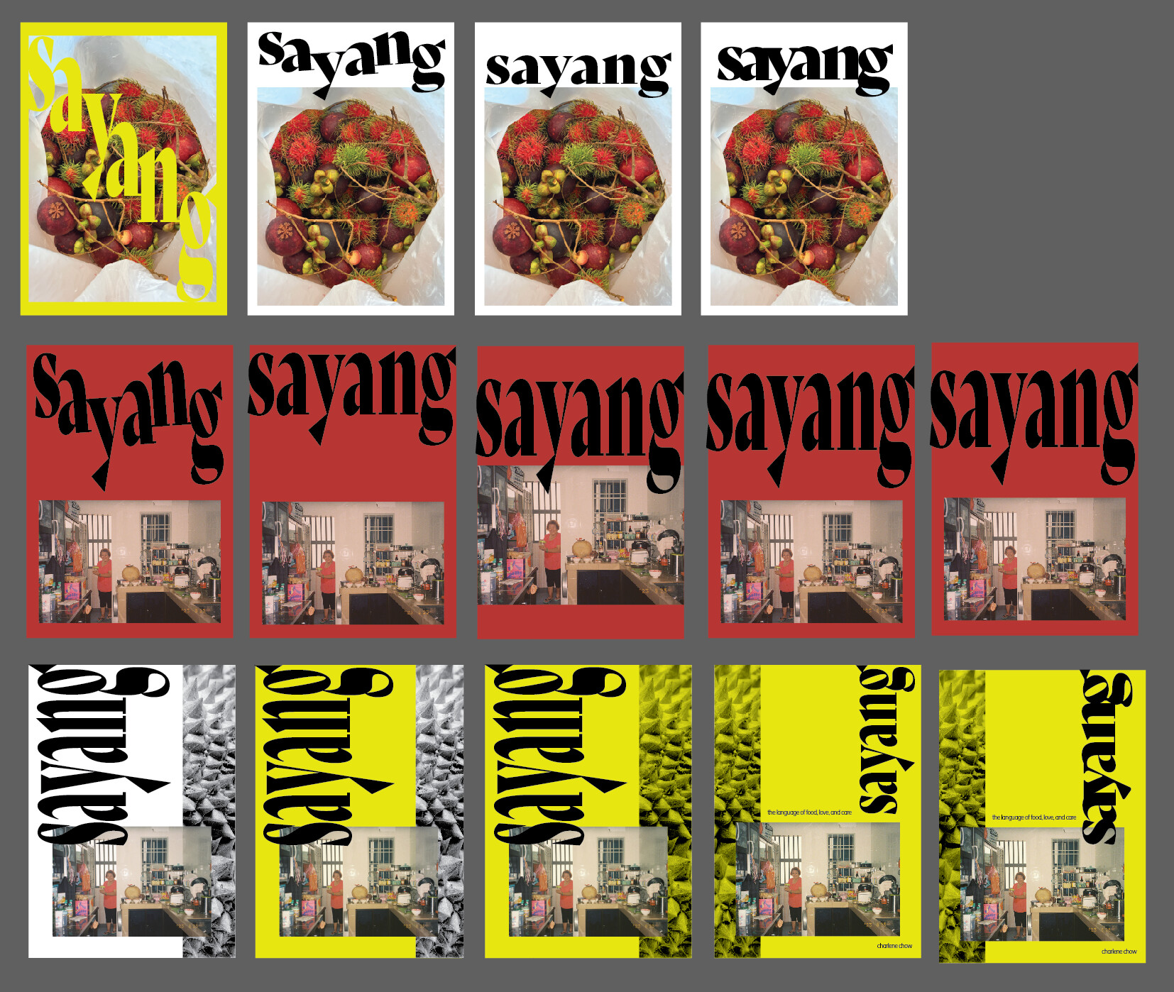
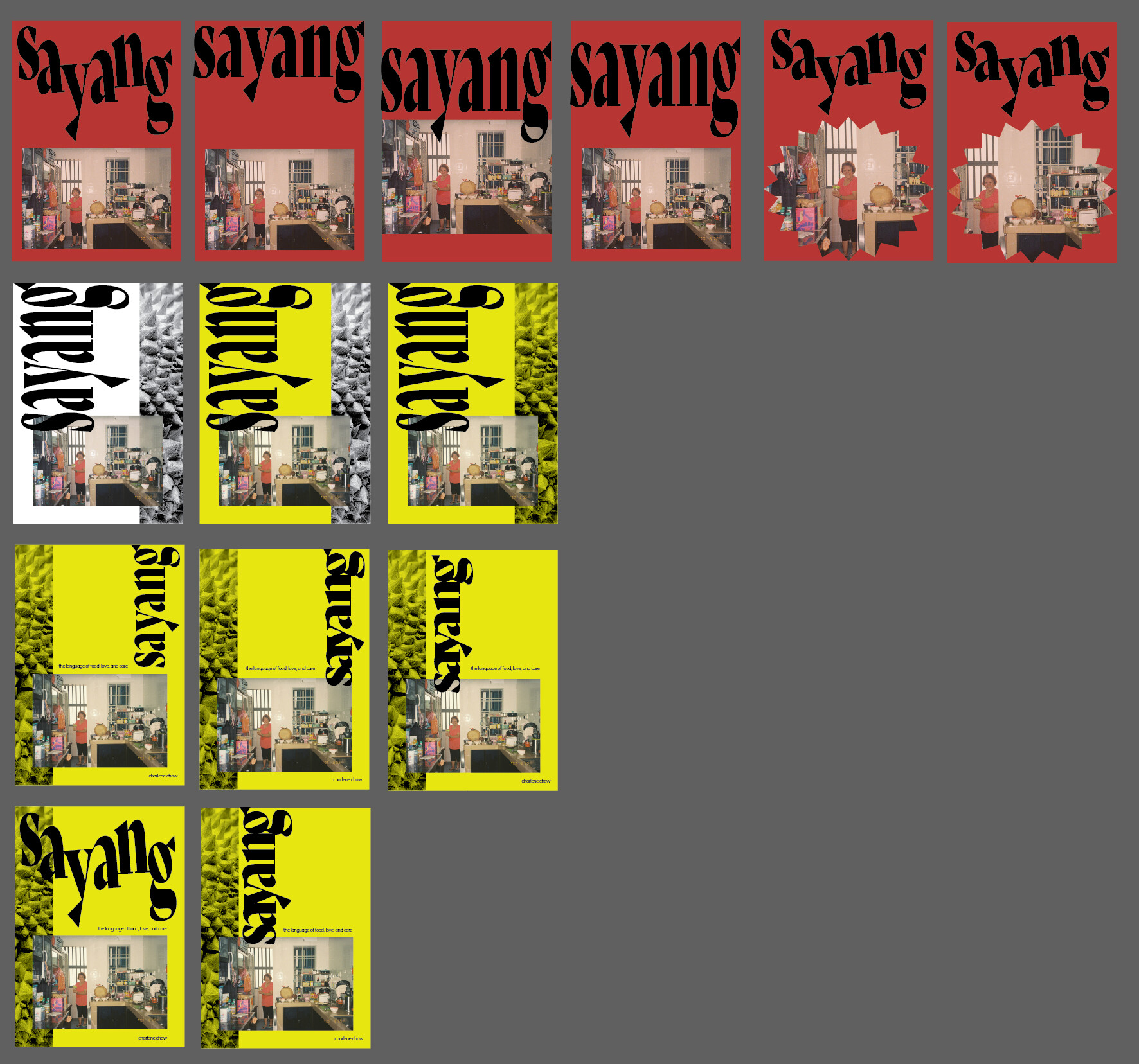
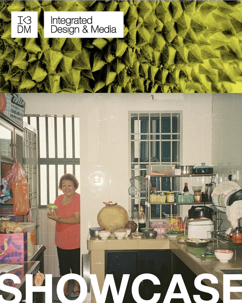
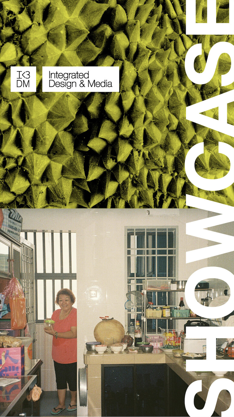
Opening InDesign, I worked first on the zine cover in order to have my project posters submitted to my program for printing. I treated InDesign as my playground, exploring and pushing different design iterations. I knew I wanted the project to be named Sayang, so I worked on several typography logo designs in conjunction with different layers of photos.
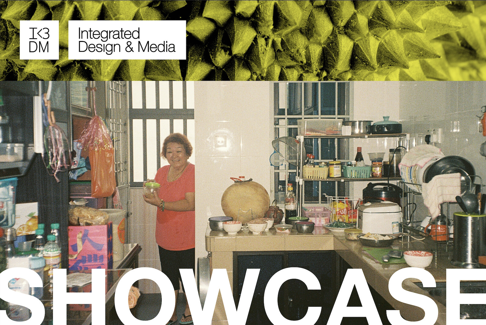
Based on the final cover, I sent the following assets over to my program to use in various socials and around the building to promote the IDM senior showcase.
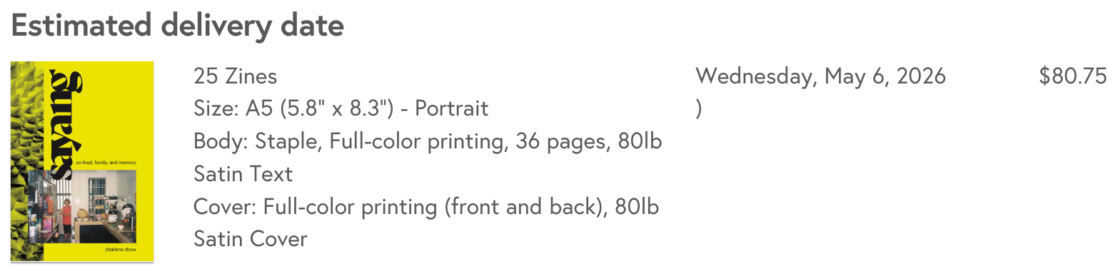
As I designed page spreads, I also had to decide on elements of the physical book itself such as finish, paper weight and binding options. Mixam, the printing company, let me customize specs and get live price estimates, so I settled on 25 copies and used their shipping estimator to make sure the zines would arrive in time for the showcase, keeping me on track against my deadlines.
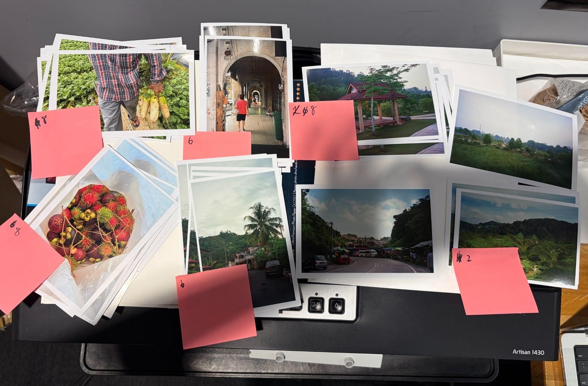
After sending off my InDesign file to Mixam, I turned my focus onto physical showcase elements. I knew I wanted to leave showcase attendees with a token of my project, combined with a desire to craft elements by hand. I settled on the following physical print elements.
Photo Prints — Formatted and cut down from large-format paper.
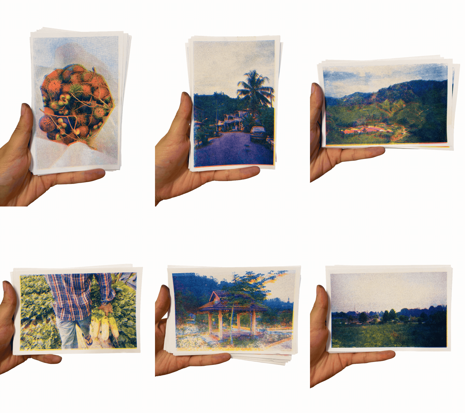
Riso Prints — Ran several color ink combinations and print tests through Spectrolite and risograph printer. Chosen for their texture and production speed. I really love the textures and colors that are achieved through the risograph process. Take a closer look below!
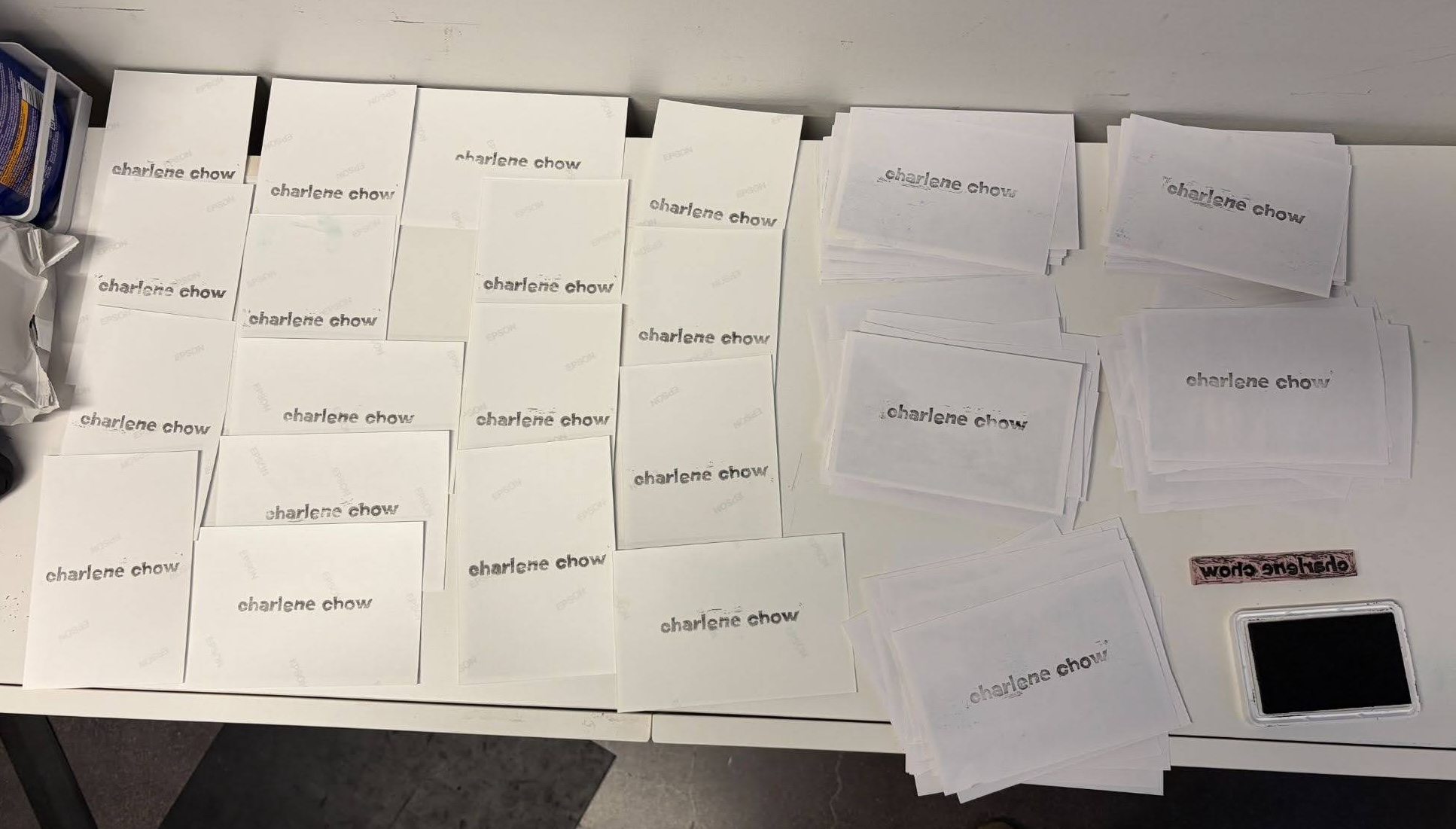
Linocut Stamping — Hand-carved linocut stamp of my name to mark all prints.
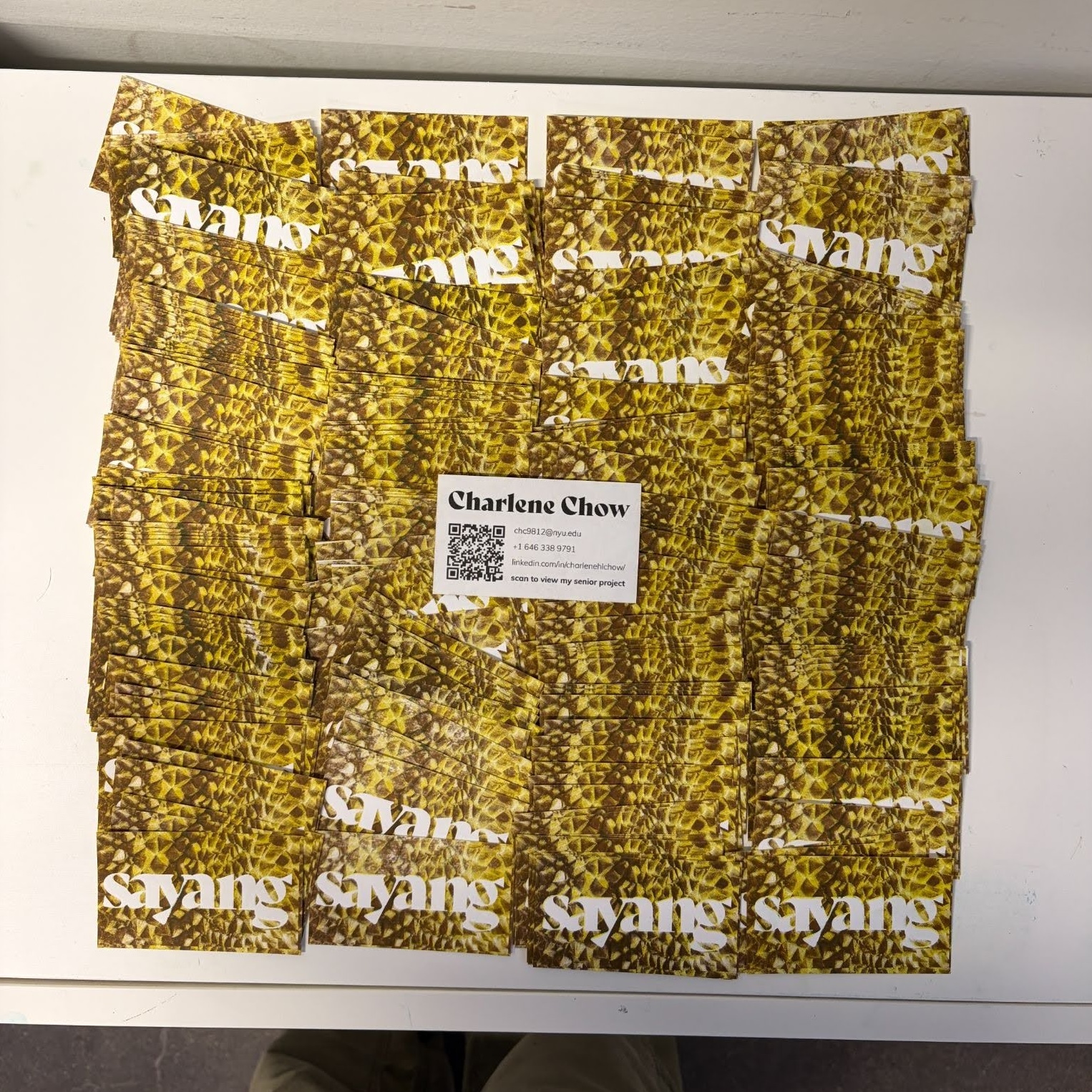
Business Project Cards — Risograph business cards linking to the digital zine. Designed as a compact alternative to a single oversized QR code on the table.
Stickers — Formatted and printed fruit stickers via Cricut machine.
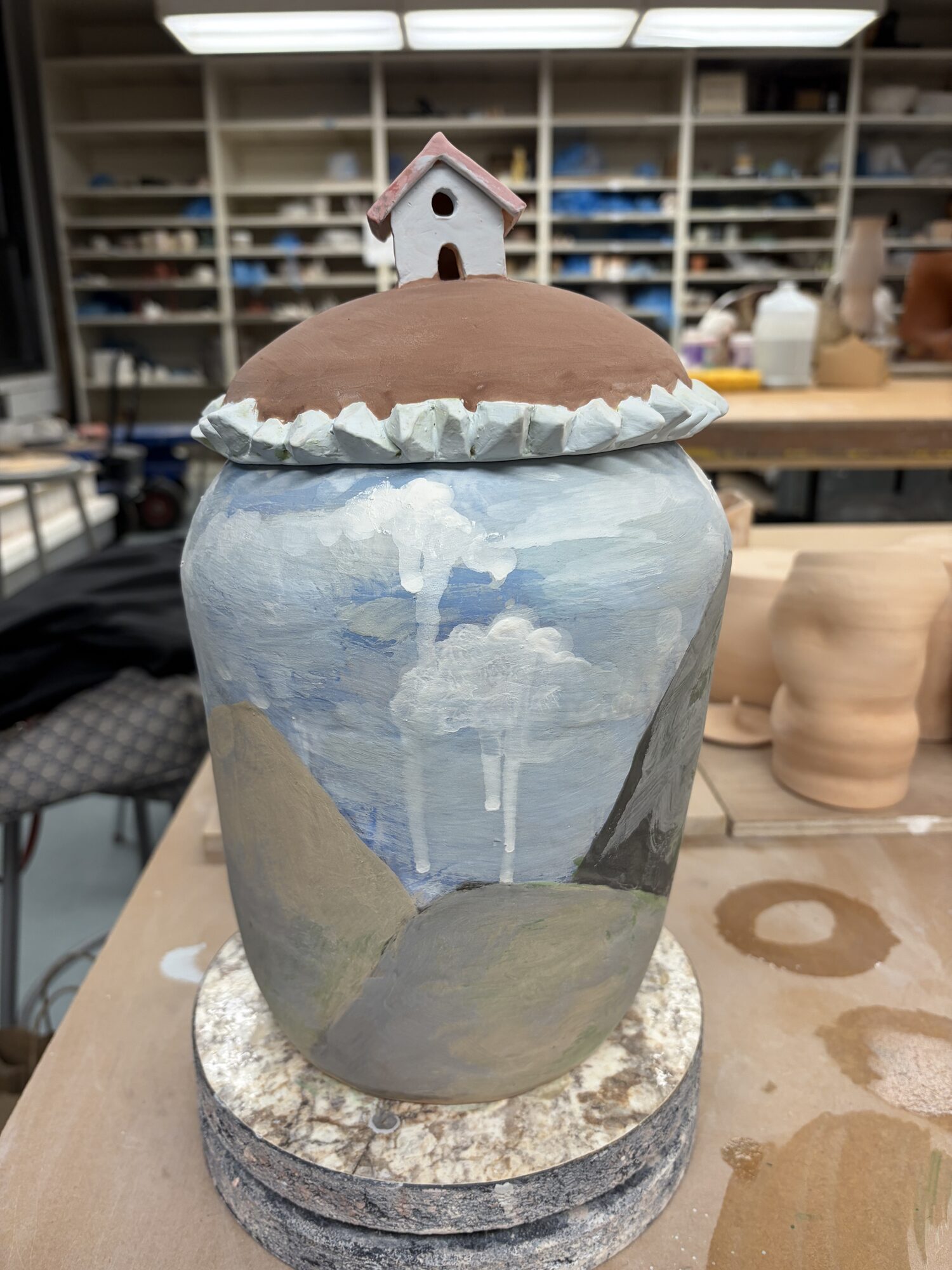
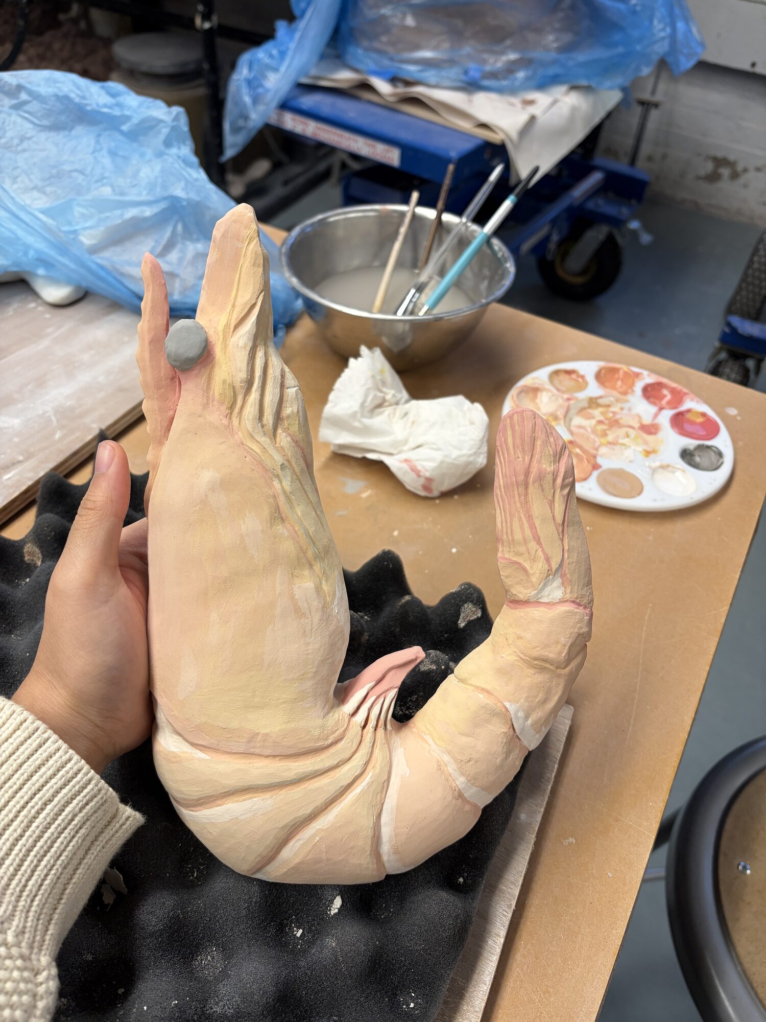
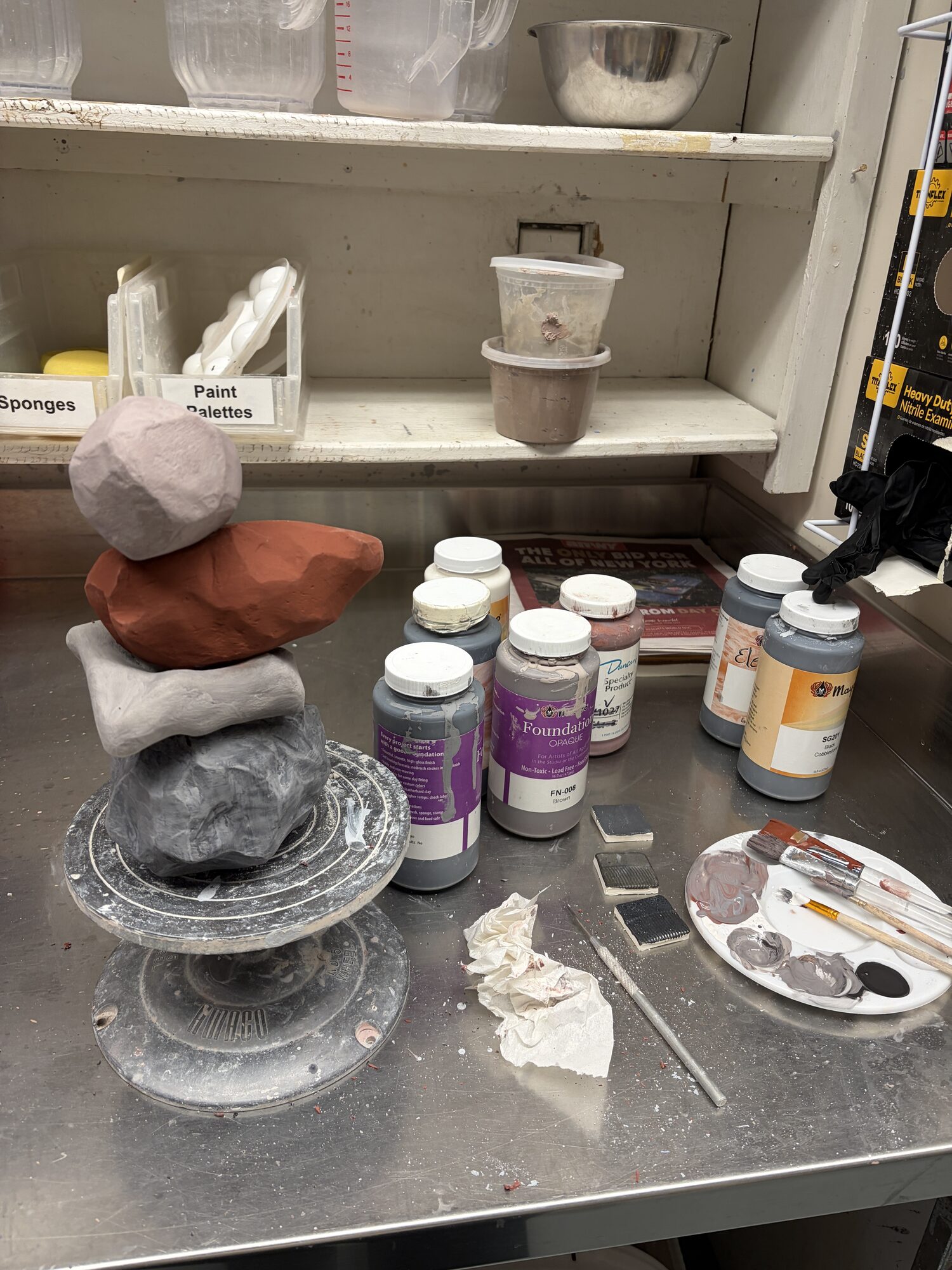
In the same final semester, I took my first ceramics class and created several pieces to include in my senior showcase.
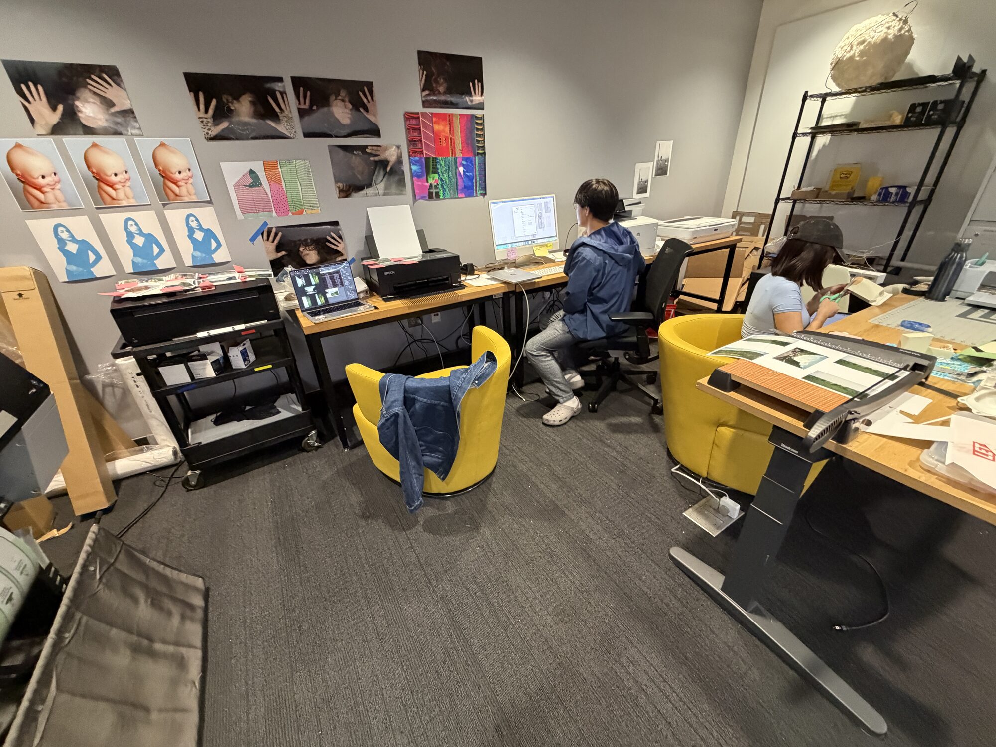 In the Print Lab with Fellow Classmates!
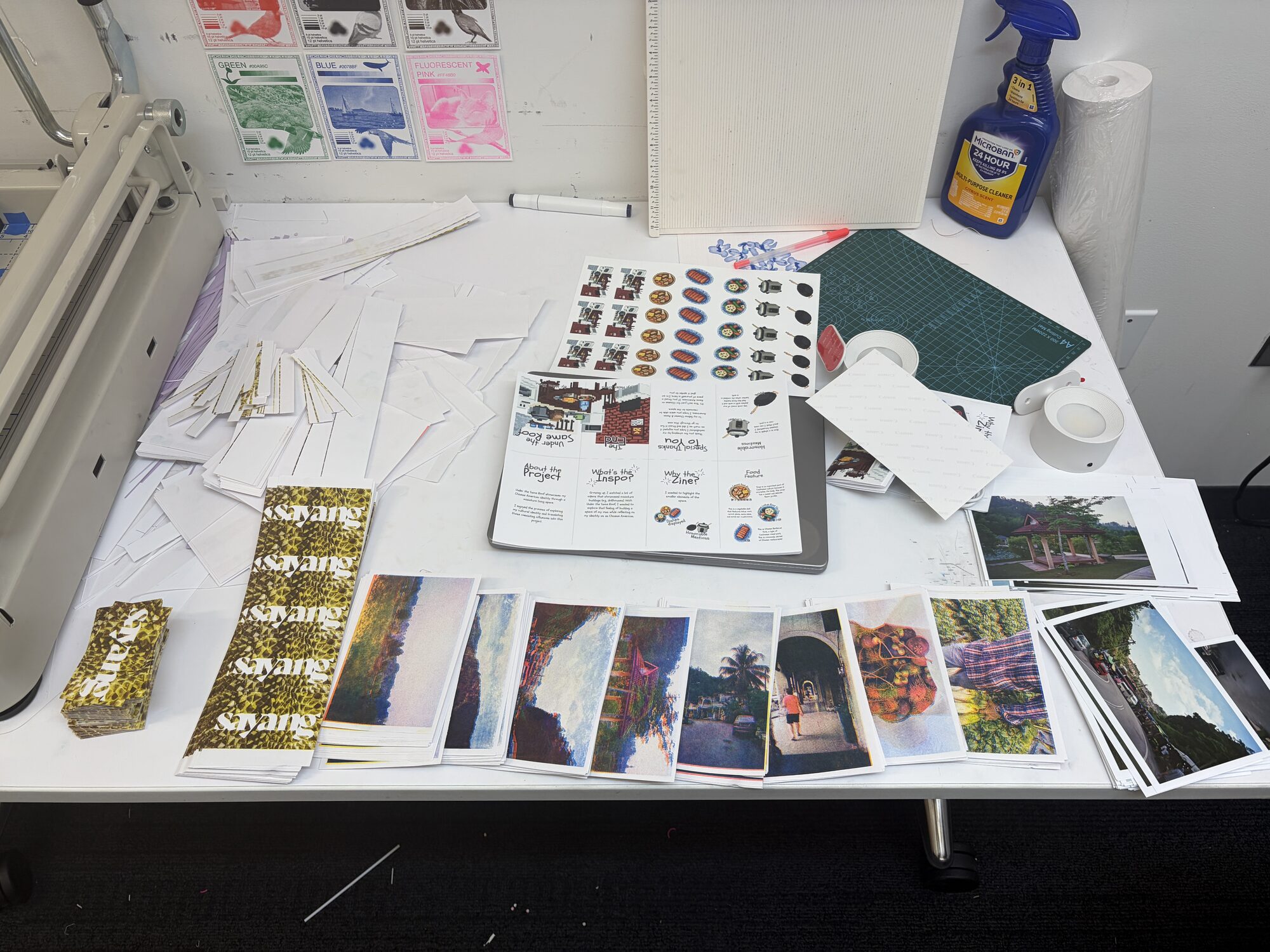 Using the Industrial Paper Cutter with a Friend!
The semester long project culminated in a three hour senior showcase attended by over 800 people consisting of family, friends, faculty, and guests.
I had so much fun creating this piece of work in my final semester as a student. I've always considered photography to be a small hobby, so being able to combine it with my design skills allowed for greater confidence in both. On a more technical level, I was able to develop my InDesign skills and gain a better understanding of print media. I was so glad to have been able to work with physical media through techniques like risograph and linocut, adding to my ever-growing list of craft hobbies.
This project pushed me to be more vulnerable in my design than I've been before. This idea mattered to me because it came directly out of being able to bring my parents back to Malaysia for the first time early in the year. Making this zine was a way for me to process the emotions of that trip and my connection to my motherland.
I want to give special thanks to everyone who helped me in this process. Nick Katsivelos, my senior project professor, guided the project from start to finish. Samantha Jackson, IDM's showcase coordinator, and Gabriella Cammarata, IDM's senior technician, coordinated the entire showcase and were always there for questions. Brooke Schneider, professor of Ceramics for Non-Majors class at NYU, taught me one of my new favorite hobbies. And to my fellow IDM classmates and friends — thank you for all the feedback, company, and support!